Artistic choice
Landflix Odyssey » Devlog
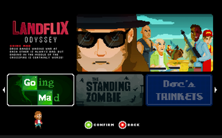
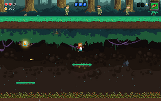
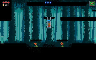
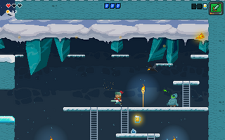
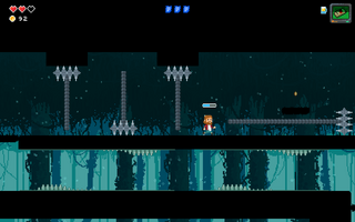
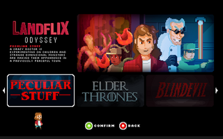

Hi everyone, today we'd like to talk you about our pixel art.
At the beginning of the development we had to decide the details amount we wanted our pixel art to have. Our pixel artist, Francesca, made a few sketches and tries to see what kind of style we wanted to have.

In the end we opted for a less detailed pixel art, the one that the game has now, for 2 reasons:
1) We wanted it to have a "snes" like feel.
2) Being on a budget needed for a fast work to finish the project as soon as possible.
In the end we have to say, we are satisfied, and like our choice in style, but we always thrive to improve it further, adding particles, details and animations.
Which would you have picked?
Get Landflix Odyssey
Landflix Odyssey
The first Netflix’s parody videogame!
| Status | In development |
| Author | Fantastico Studio |
| Genre | Platformer |
| Tags | 16-bit, 8-Bit, Metroidvania, netflix, Puzzle-Platformer, Shoot 'Em Up |
More posts
- Breaking Bad’ 10th AnniversaryJul 19, 2018
- Get a jump on!Jul 17, 2018
- Jumping between acid potions to save the school!Jul 13, 2018
- Slaying zombies in Virginia!Jun 13, 2018
- Cooking meth with Walter WhiteJun 02, 2018
- Met(h)icolous jobMay 03, 2018
- Getting beaten by the ninjas!Apr 20, 2018
- Grappling Hook effect in Landflix OdysseyApr 12, 2018
- Trippin' in a fast foodApr 10, 2018
- Stealth level WIPApr 05, 2018
Leave a comment
Log in with itch.io to leave a comment.